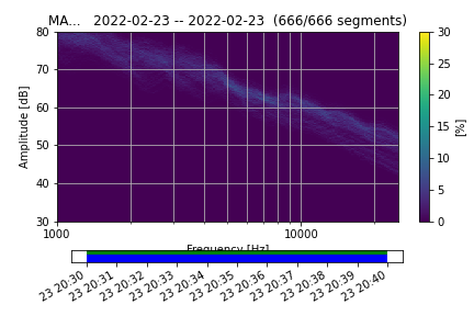
I am using the PPSD.plot() for high frequencies. Therefore, the xaxis label is correctly changed to frequency from periods. Unfortunately the timeline of “used/skipped” time does hide the label partially. Is there an option to move the coverage timeline/xlabel
without modifying the source code?
If you do PPSD.plot(..., show=False) it returns the figure and you can tweak everything with matplotlib API and then show or save the figure later. You could try if a simple plt.tight_layout() fixes things..