I am trying to analyse daily seismic recordings near a river to capture signals associated with river processes. It is new for me, and not sure if I am doing things right. I cut the signal in 6 hours windows and tried to plot spectrogram/PSD (not sure of the difference between Spectro and PSD).
Here is the basic python script I used.
import numpy as np
import matplotlib.pyplot as plt
import obspy
from obspy import read
st = read("WU.JSP2.00.ELZ.D.2022.231.000002.SAC\_6h")
print(st)
tr=st\[0\]
print(tr.stats)
sps =int(st\[0\].stats.sampling\_rate)
st.plot()
fig = plt.figure()
ax1 = fig.add\_axes(\[0.1, 0.75, 0.7, 0.2\]) #\[left bottom width height\]
ax2 = fig.add\_axes(\[0.1, 0.1, 0.7, 0.60\], sharex=ax1)
ax3 = fig.add\_axes(\[0.83, 0.1, 0.03, 0.6\])
t = np.arange(tr.stats.npts) / tr.stats.sampling\_rate
ax1.plot(t, tr.copy().data, 'k')
tr.spectrogram(wlen =2_sps, per\_lap=0.95, dbscale=True, log=True,cmap="rainbow")
st = read("WU.JSP2.00.ELZ.D.2022.231.000002.SAC\_12h")
print(st)
tr=st\[0\]
print(tr.stats)
sps =int(st\[0\].stats.sampling\_rate)
st.plot()
fig = plt.figure()
ax1 = fig.add\_axes(\[0.1, 0.75, 0.7, 0.2\]) #\[left bottom width height\]
ax2 = fig.add\_axes(\[0.1, 0.1, 0.7, 0.60\], sharex=ax1)
ax3 = fig.add\_axes(\[0.83, 0.1, 0.03, 0.6\])
t = np.arange(tr.stats.npts) / tr.stats.sampling\_rate
ax1.plot(t, tr.copy().data, 'k')
tr.spectrogram(wlen =2_sps, per\_lap=0.95, dbscale=True, log=True,cmap="rainbow")
I don’t know how to include the colour scale too. Any advice will be great.
what about zooming and changing vertical scale?
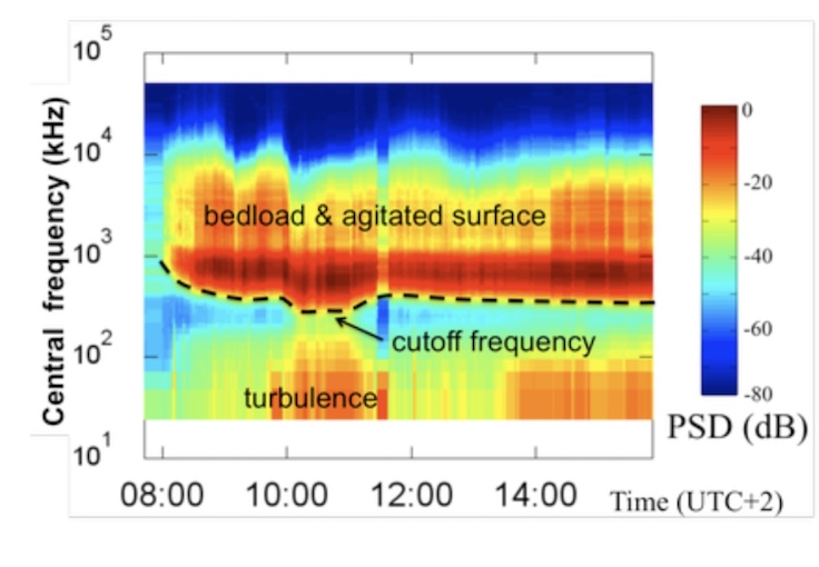
Here is the kind of figure I would like to get at the end
Thx.