Plotting PPSD of all station components as subplots vertically w/ new high/low noise model

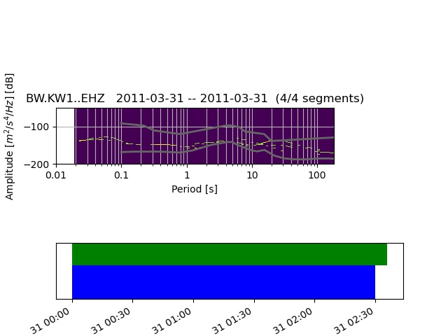
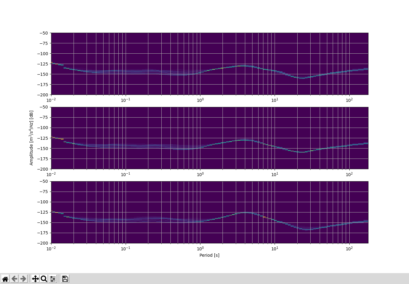
Trying to do a noise analysis for potential sites and want to create a single figure of 3 PPSD plots for each of the components stacked vertically. My code currently creates a individual PPSD figure. My approach originally was to create each figure and save those figures as a pickle file using

pklout = ppsd.plot(show=False) # this creates the figure and saves the output to pklout
pl.dump(pklout,open(tmppath + pklname,‘wb’)) # writes the Figure(640x480) to a pickle file

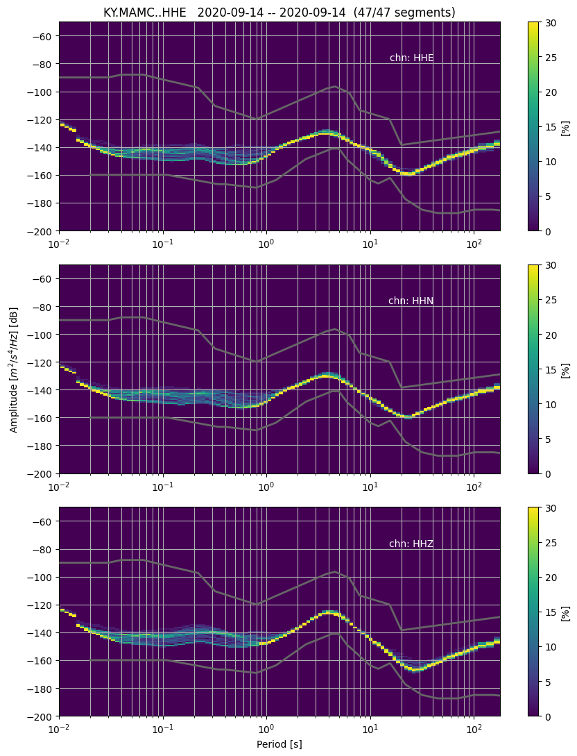
I wanted the then load each of the “pickled” figures back into memory in a different script to then stack each figure into a new figure vertically. Since the current PPSD function doesn’t appear to have the new high and low noise model as a plotting option (GitHub - ewolin/HighFreqNoiseMustang_paper), I also wanted to try and add these to the PPSD plots.

Can someone give me some tips on how to plot each of the individual component PPSD plots into a single plot and plot the new high/low noise models by Wolin and McNamara (2020)? I have the models from that paper as text files with 2 columns (period, dB level), so I figured that I could plot those with a simple matplotlib.pyplot “plot” command.

As an aside, are the figures generated with ppsd.plot() a similar object to that of a matplotlib plot? Is the figures I’m saving to pickle essentially just “raster” data like a jpeg or png such that I can’t modify those plots outside the ppsd.plot function?

Any help on this topic is greatly appreciated!

EDIT:
A thought I had might be to actually save the variable “ppsd” to a pickle file, then load that variable into my new script. Could I then do something to the effect of

from 1st script

ppsd = PPSD(tr.stats, metadata=inv)
ppsd.add(stm)
pickle.dump(ppsd,open(tmppath + pklname,‘wb’))

Start making figure

fig, axs = plt.subplots(3, 1)
for ii in range(3):
    ppsd = pl.load(open(t_dflst.iloc[ii].item(), 'rb'))
    axs[ii+1] = ppsd.plot(show_coverage=False, show=False)  # mute show coverage because I want to keep figure uncluttered
plt.show()

After trying this last portion of code, what I found is that I create a blank figure with 3 subplots, but then each of the components ppsd’s are still plotted separately.

Hmm, looks like we indeed unfortunately don’t have the option to pass in an existing figure and list of axes to use. Usually we have that option for most plotting routines, but PPSD is one of the oldest, so I guess the need wasn’t envisioned back then.

We should add that option, but in the meantime you could try your luck with some real nerdy mockery, maybe. Here’s a quick example:

from unittest import mock
from obspy.imaging.tests.test_ppsd import _get_ppsd

ppsd = _get_ppsd()
fig, axes = plt.subplots(nrows=4)
used_axes = [fig.axes[1], fig.axes[3]]

with mock.patch('matplotlib.pyplot.figure') as mock_figure:
    mock_figure.return_value = fig
    with mock.patch('matplotlib.figure.Figure.axes', new_callable=mock.PropertyMock) as mock_axes, \
            mock.patch.object(fig, 'add_axes') as mock_add_axes:
        mock_axes.return_value = used_axes
        mock_add_axes.side_effect = used_axes
        ppsd.plot()

Pretty ugly but might still be better than pickle, dunno, just an idea.

Figure_1

Not sure what you mean by “single plot”, the above example was assuming you want full histograms with multiple axes for each station. Another option would be to just plot a certain percentile per station as a line all in one plot.

Should be trivial, use ppsd.plot(..., show=False) and then you can just add some custom plotting commands afterwards before showing or saving the Figure.

Yes, these are matplotlib objects.

Like mentioned above, these are matplotlib objects and you can do any custom matplotlib stuff you want after the PPSD plot commands before showing/saving the figure to a bitmap (or vector graphics) file.

You should consider using ppsd.save_npz(…) and the load_npz(...) counter part.

compare https://github.com/obspy/obspy/issues/2729 and https://github.com/obspy/obspy/issues/2730

So I played around with a bit of the code in Obspy’s (https://docs.obspy.org/_modules/obspy/signal/spectral_estimation.html#PPSD.plot) PPSD code.

This is a rough example of what I’m hoping to do. I have a single seismic station that has 3 components and I want to plot it’s individual channel histograms in a single figure (as shown). I can pass you some of the code if it would be helpful to see what I did. I need to add a bit to this plot, such as the title, the color bar, and the noise models. So similar functionality added to the PPSD function might be helpful in the future thought! :slight_smile: I realized that my explanation that I gave earlier of what I was hoping to create might not have been very clear. Hopefully this helps.
I’m not super familiar with Mock though… I’ll have to do some digging into that to see if that method might also work.
But, Pickle seemed to work just fine on my end. Just saving my variable created in the previous code to a pickle file and then reloading the file in another script was pretty trivial. I’m sure that I could have structured things a bit better to where even using pickle would be unnecessary.

Final update. This is more or less what I hope PPSD.plot will be able to do in the future. I know that PPSD currently only processes 1 component for a single object, so this type of functionality might require quite a bit of change to PPSD to handle several components. Once again, I’d be happy to share my code with anyone. Just realize that I’m not a python engineer so my code is extremely messy

It could certainly not hurt if you attached your code here, there’s always a chance somebody might stumble on it and find it helpful. :slight_smile:

Also curious how you worked it out :wink:

1 Like

So once again, this is very much just a kludge of different codes from the original PPSD methods/codes and others to make the above plot, so it is very messy and I’m positive there is a “cleaner” way to create these, but time was of the essence when I was trying to put this together so… I apologize. Hope you and anyone else who needs this find it useful.
The new noise model used here can be found on github using the link in the very first part of my question when I originally posed it.

import pandas as pd
import numpy as np
from obspy.core import UTCDateTime
from obspy.core.util import AttribDict
import matplotlib.pyplot as plt
import glob
import pickle as pl
from obspy.signal import PPSD

hl_noise_dir = -- PATH TO NEW NOISE MODEL -- '/HighFreqNoiseMustang_paper-master/'
f_hnm = hl_noise_dir + 'wolinmcnamara_HNM.mod'
f_lnm = hl_noise_dir + 'wolinmcnamara_Perm_LNM.mod'

# read in the high and low noise models
hnm = pd.read_csv(f_hnm, delimiter=' ', header=None)
lnm = pd.read_csv(f_lnm, delimiter=' ', header=None)

outpath = -- PATH TO WORKING DIRECTORY -- 

# identify pickle files and unique stations
	## NOTE: I had a previous code that calculated the PPSD for individual
	## components and outputted the variable into a PICKLE file. That is 
	## what is being read here are the various Pickle files I output from 
	## that previous code.

lstfil = glob.glob(outpath + '*.var.pkl')

df_lfil = pd.DataFrame(lstfil, columns=['pkl_path'])
cnt = 0
for x in lstfil:
    tlst = x.split('/')
    if cnt == 0:
        cnt += 1
        flst = [tlst[-1]]
        # also identify unique stations
        lsta = [tlst[-1].split('.')[0]]
    else:
        flst = flst + [tlst[-1]]
        lsta = lsta + [tlst[-1].split('.')[0]]
# find unique stations
df_sta = pd.DataFrame(lsta, columns=['Name'])
sta = df_sta.Name.unique()

# Build a rectangle in axes coords for plotting and placement 
# of "CHN: ???" Text
left, width = .35, .5
bottom, height = .35, .5
right = left + width
top = bottom + height

# Loop through stations
for sname in sta:
    idx = [ii for ii, ss in enumerate(lstfil) if sname in ss]
    t_dflst = df_lfil.loc[idx].reset_index(drop=True) # get DF of all the channels for this station instance
    # number of files
    df_len = len(t_dflst)

    # Start making figure
    fig, axs = plt.subplots(df_len, 1, figsize=(9, 11))
    # Initialize attribute table defaults
    fig.c = AttribDict()
    label = "[%]"
    max_percentage = 30  # max percent of colorbar
    fig.c.cumulative = False
    # fig.c.cmap = obspy_sequential
    fig.c.label = label
    fig.c.max_percentage = max_percentage
    color_limits = (0, max_percentage)
    fig.c.color_limits = color_limits
    fig.c.grid = True
    fig.c.xaxis_frequency = False
    period_lim = (0.01, 179)
    # Iterate through different ppsd's
    for ii in range(df_len):
        axs[ii].semilogx()
        if ii == 2:
            axs[ii].set_xlabel('Period [s]')
        axs[ii].set_xlim(period_lim)
        # read in pickle variable for ppsd
        ppsd = pl.load(open(t_dflst.iloc[ii].item(), 'rb'))
        # from ppsd.plot
        ## Title
        if ii == 0:
            title = "%s   %s -- %s  (%i/%i segments)"
            title = title % (ppsd.id,
                             UTCDateTime(ns=ppsd._times_processed[0]).date,
                             UTCDateTime(ns=ppsd._times_processed[-1]).date,
                             ppsd.current_histogram_count,
                             len(ppsd._times_processed))
            axs[ii].set_title(title)

        # Y limits
        axs[ii].set_ylim(ppsd.db_bin_edges[0], ppsd.db_bin_edges[-1])
        if ii == 1:
            axs[ii].set_ylabel('Amplitude [$m^2/s^4/Hz$] [dB]')

        # format data
        data = (
                ppsd.current_histogram * 100.0 /
                (ppsd.current_histogram_count or 1))

        ## Add noise models
        axs[ii].plot(hnm[0][:], hnm[1][:], '0.4', linewidth=2, zorder=10)  # High Noise Model
        axs[ii].plot(lnm[0][:], lnm[1][:], '0.4', linewidth=2, zorder=10)  # Low Noise Model

        axs[ii].text(right, top, 'chn: ' + ppsd.channel,
                horizontalalignment='right',
                verticalalignment='top',
                transform=axs[ii].transAxes,
                color='white')

        xedges = ppsd.period_xedges
        fig.c.meshgrid = np.meshgrid(xedges, ppsd.db_bin_edges)

        c = axs[ii].pcolormesh(
            fig.c.meshgrid[0], fig.c.meshgrid[1], data.T,
            zorder=-1, vmax=max_percentage)
        fig.c.quadmesh = c

        # Grid
        color = {}
        axs[ii].grid(b=True, which="major", **color)
        axs[ii].grid(b=True, which="minor", **color)

        #Colorbar
        cb = plt.colorbar(c, ax=axs[ii])
        # cb.set_clim(*fig.c.color_limits)
        cb.set_label(fig.c.label)
        fig.c.colorbar = cb

    fig.tight_layout()
    fname = outpath + ppsd.network + '.' + ppsd.station + '.' + ppsd.location + '.' + 'all_comp.'

    plt.savefig(fname + 'png', bbox_inches='tight')
    plt.savefig(fname + 'pdf', bbox_inches='tight')

    plt.show()
2 Likes

Oh OK, so you basically copied the plotting code from PPSD and make the plots yourself, since you couldn’t tell obspy to plot into specific Axes.
Good that you got it working for you, but like I said, we want to have the option to plot into specific provided Axes directly in ObsPy I think.