Good afternoon, I’m really new at Python and ObsPy and I need to plot the data spectrum raw of some earthquakes.
I am using a code from ObsPy documentation Seismometer Correction/Simulation — ObsPy 1.4.2 documentation
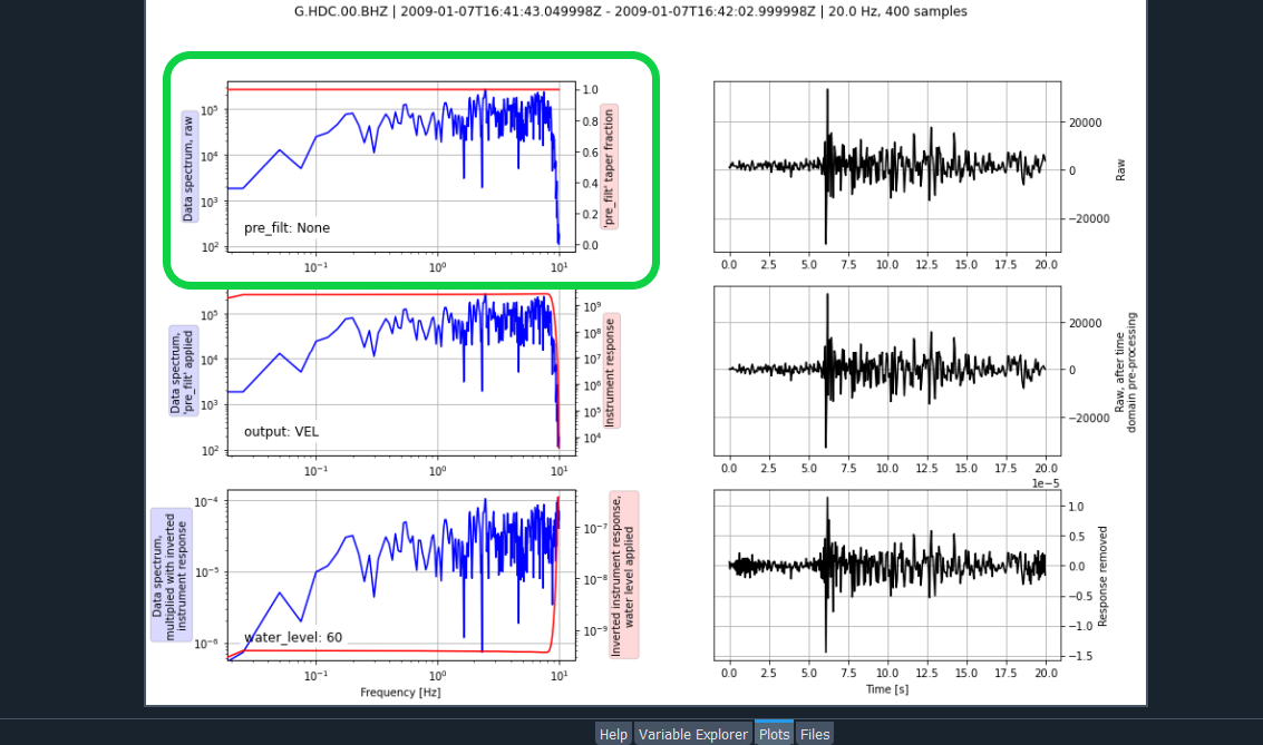
“”"
t1 = UTCDateTime(“2009-01-7T16:41:43.000”)
t2 = UTCDateTime(“2009-01-7T16:42:03.000”)
fdsn_client = Client(‘IRIS’)
st = fdsn_client.get_waveforms(network=‘G’, station=‘HDC’, location=‘00’,
channel=‘BHZ’, starttime=t1, endtime=t2,
attach_response=True)
st.remove_response(plot=True)
“”"
When I run this code, plots the raw data, the pre_filt applied and water level applied.
How can I just plot de data spectrum raw, only that?
Can someone help me, I feel lost
Thank you