Dear Forum.
I have a set of file mseed (from diffent seismic stations) that I’d like to plot in one figure n=only the vertical channels. I did the following code lines:
import os
from obspy import read
import matplotlib.pyplot as plt

st_ = read('*mseed')
fig = plt.figure()
for comp, color in zip(['Z'], ['r','g','b']):
    st_ = st_.select(component=comp)
    st_.plot(show=False, fig=fig, color=color, type="relative")
plt.show()
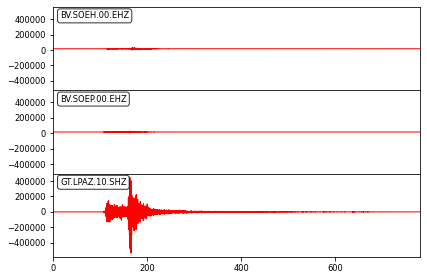
I was able to get the plot, however, the result is not the desired one, the first issue is that I am not able to plot the streams with different colors.
the second, the size, seems that the figure makes an auto scale and attenuate 2 over 3 streams. Attach the figure.
Would you mind please give some tips?,
Stay safe and best regads.
Tonino
For custom plots, you’ll end up writing your own plotting code with matplotlib, eventually. Our Stream.plot() is not designed for full flexibility, it’s just to get something to show up on people’s screens fast with a simple call.
I don’t fully understand what you want to get as a result. I figured, you want to plot one station per subplot with all three components in one Axes with different colors?
@megies , thanks for the time.
As you said, I would like to plot the vertical components (Z) from different seismic station on a figure, each Z channel in one Axes with different color.
So, basically I will need to have Traces of each channel and to loop over a “for loop” to plot them right?
Stay safe and best regards,
Tonino
import os
from obspy import read
import matplotlib.pyplot as plt

st = read('*mseed')
st = st.select(component='Z')  # corrected this line, the output wasn't assigned to "st" again
seed_ids = {tr.id for tr in st}
colors = [....]  # should make sure it has same length as seed_ids

fig, axes = plt.subplots(nrows=len(seed_ids))

for seed_id, ax, color in zip(seed_ids, axes, colors):
    for tr in st.select(id=seed_id):
        ax.plot(tr.times('matplotlib'), tr.data, color=color)
    ax.xaxis_date()  # this makes the ticks show up properly formatted as dates and also puts tick locations at spots that make sense when looking at dates

fig.autofmt_xdate()  # thismakes the ticks slanted to allow for more room needed to display the tick texts
plt.show()
You’re welcome. One thing to note in there is that people often not take into account special cases when they start out, because it works with the files the used for trying it out.
As an example, the above takes into account that there could be gappy data, i.e. multiple traces with the same SEED ID. =)
I see code that doesn’t take that possibility into account all the time.